Smart car wash
2023
Smart car wash
2023
Innovation. Inspire. Act. — usability. —
Innovation. Inspire. Act. — usability. —
SMART
CAR
WASH
▲ Project goal
The business was renamed, and the issue of rebranding arose. Before that, the brandbook did not meet the needs of the company. After a year of work, we managed to rebrand and conduct the necessary UX research both within the company and the audience. Based on the analysis, a comprehensive solution was developed, which included everything from the logo to the terminal system design and equipment design.


PORTAL ®
BRAND STRATEGY

Pantone 532 C
C:0.50 M:0.50 Y:0.50 K:0.100
R7 G7 B7
HEX 070707
C:0.50 M:0.50 Y:0.50 K:0.100
R7 G7 B7
HEX 070707
TECHNOLOGY_

Pantone Orange 021 C
C:0.00 M:0.69 Y:0.92 K:0.00
R255 G80 B20
HEX FF5014
C:0.00 M:0.69 Y:0.92 K:0.00
R255 G80 B20
HEX FF5014
Innovation_

Pantone 000 C
C:0.00 M:0.00 Y:0.00 K:0.00
R255 G255 B255
HEX FFFFFF
C:0.00 M:0.00 Y:0.00 K:0.00
R255 G255 B255
HEX FFFFFF
usability_
visual communication
01
An important step was to determine the identity. The style before the rebranding was very outdated and could not allow the business to present itself as a serious brand. The design was brought into a single system, a lot of work was done with all the materials in the physical sinks, where it was necessary to take into account the uniform color of orange. Even the guides for photographers were rewritten and preparatory work was carried out before creating the style, where we tested the creation time for materials ranging from signage and visualizations of objects, to such small things as business cards. After much coordination of the mudboards, a decision was made in the final style.
Project content
02
Orange was the color of the original brand, and it was necessary to preserve it. Only the shade, #FF5014, has changed, which set the company apart from many others. 3D graphics were chosen for the sake of the theme of technological business and to exclude the possibility of competitors to assign brand identity. The design was minimalistic and pleasing to the eye, but memorable in the Russian market.
Why was this style chosen?
03
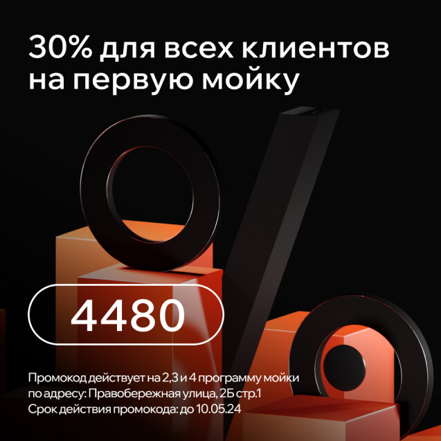
Our communication strategy is based on the developed brand slogan «PORTAL», which refers to car care services and technology (future). The campaign is a carrier of revolutionary technologies for car washing and car care in the Russian market.
We turn to the archetypes of the guardian (we will help you), the magician (we look into your future) and a wise man (we'll give you some advice).
The logo was created and approved before the project, but based on it, it was possible to develop a unique style that is recognizable in the market and has no competitors in terms of quality and convenience both within the company and among franchisees.
▲ Attention! The project is under the NDA, purely for informational purposes. The PORTAL is a trademark, so only design examples will go further. Thanks for understanding.
04

All the stickers for the equipment and instructions were redesigned and sized, the stickers themselves became more wear-resistant, which helped reduce the cost of maintaining the design at the car washes and brought them to a uniform appearance.
▲ Color Palette

HEX
#342345
RGB
#342345
Branding orange
HEX
#342345
PRIMARY
RGB
#342345
HEX
#342345
White
RGB
#342345
HEX
#342345
GRAY
RGB
#342345
HEX
#342345
DARK GRAY
RGB
#342345
#342345
#342345
Branding GRADIENT


PORTAL

PORTAL
PORTAL

PORTAL

PORTAL

PORTAL

PORTAL

PORTAL

PORTAL

PORTAL

PORTAL

PORTAL
After conducting a survey among employees, it was decided to build a system of interaction between the design department within the company in such a way that the created planogram was a guide with all the necessary printed layouts and visualizations, ready orders to the printing house, provided all addresses of physical sinks and updated in total. The development of the plan program lasted 2 months, until the feedback from the staff gave a positive result.
Initially, the concept of planograms seemed to the management to be very expensive to maintain and was not conducted. Because of this, a lot of questions arose from the design of the premises, franchisees and ordinary people simply got confused, which put a strain on the marketing department.
▲ Planograms as the basis for
the functioning of design
the functioning of design
▲ How could the design solve the burden of marketing department?
All the stickers for the equipment and instructions were redesigned and sized, the stickers themselves became more wear-resistant, which helped reduce the cost of maintaining the design at the car washes and brought them to a uniform appearance.
▲ Part of the planogram
mobile app

The mobile application originally had the function of paying for a car wash when approaching it. In other words, you don't have to get out of the car and do anything, all the processes have been fully automated. The task was to provide convenient payment, search for the nearest car washes, as well as information about the development of the PORTAL.
Project content
01
I have revised CJM to the basis of target audience analysis. Among the disadvantages, I can single out that it was not possible to conduct more in-depth research due to budgets and deadlines, so I had to analyze the call center's data on payment errors and so on and analyze it myself. At the exit, we improved the graphics, added features and stories to the application, filled it with news and referral programs.
What have you been able to improve with rebranding?
02
03


Pay via the mobile app
> 48%
of customers
of customers
It is included in the TOP 10 applications
of the Runet 2023 Rating.
of the Runet 2023 Rating.
Monthly downloads
> 12 400


TERMINAL
A device for choosing a sink and paying for it, which is available at each point of the smart washing Portal. It is also used as an advertising object. The design of the terminals took into account the location, the behavior of the screens in the sun and the convenience of reading QR codes, interacting with the user and informing the consumer about the brand. The chemistry stand is located nearby, as is the urn.
Intellectual property: IJ System - computer program “IJ System", certificate No. 2019665659 dated 11/27/2011 2019


Top 5 long-term interests
Placing ads on terminals
18-55 years old,
The core is 25-44 years old
The core is 25-44 years old
Age
Finance
371%
Transport
324%
Construction
317%
Appliances
263%
24,7%
75,3%
MAN
WOMAN


A device for choosing a sink and paying for it, which is available at each point of the smart washing Portal. It is also used as an advertising object. The design of the terminals took into account the location, the behavior of the screens in the sun and the convenience of reading QR codes, interacting with the user and informing the consumer about the brand. The chemistry stand is located nearby, as is the urn.


